• HiCanYU

Flows, images, interactions, processes and "Photogs" likeness ©HiCANYU

Overview


The What: Travelers are typically pressed for time, Overstimulated on holiday and have a short attention span or Have a smaller budget due to travel expenses (Hotel, Transportation, Food)

The Why: There are limited cost effective traveler options for Photography. As a traveler you can  Hire a photographer before your trip and bring them along, Use a complicated a service & ambiguous booking platform or Take Selfies, use Selfie Sticks or asking strangers.

Value Prop:

  • Affordability
  • Easy Access to an international service
  • Seamless integration for social media
  • Contribution to the gig economy

My Contribution

  • Art Direction
  • Complete UCD Process
  • User Research
  • Interface Design
  • Interaction Design

The Process


Kicking Off

My initial engagement with HiCanYu was high-level. The team had a few excel spreadsheets and screenshots of features they were looking to incorporate. The founders are extremely creative and flexible around solutions.

I started them off with an initial round of screens that articulated their ideas along with a few best practice mobile app features. The goal was to solidify a MVP, so, the process was extremely agile.

Went went into user testing  almost immediately. This project is unique in many ways and because the concept is innovative, I wanted to make sure to make sure the  UX functions resonated and aligned with the traveler’s mental models.

Testing Methods

I drove the UX Research initiative while on this project. “We” is used to frame the stakeholders full participation in the process.

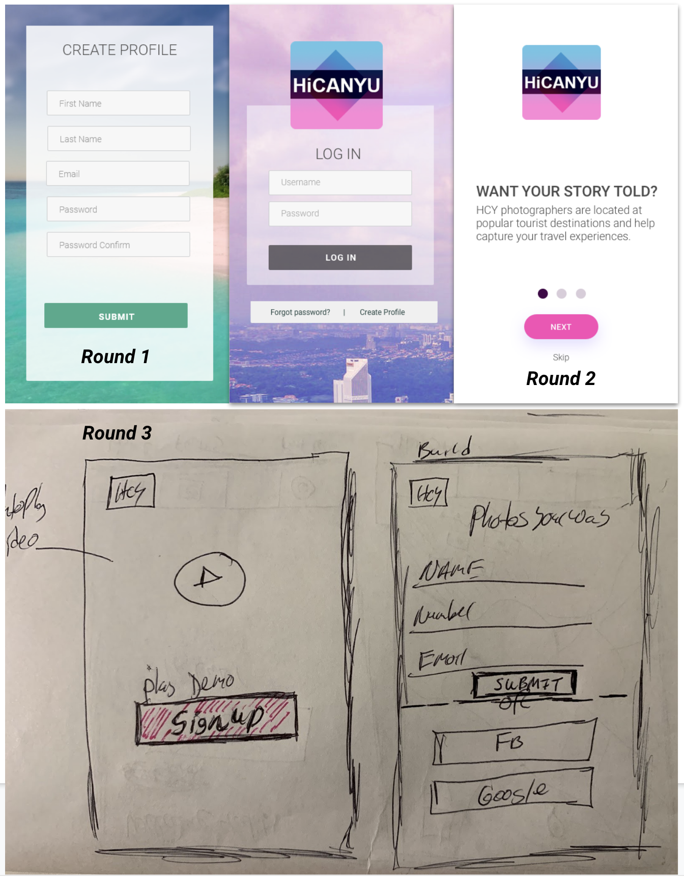
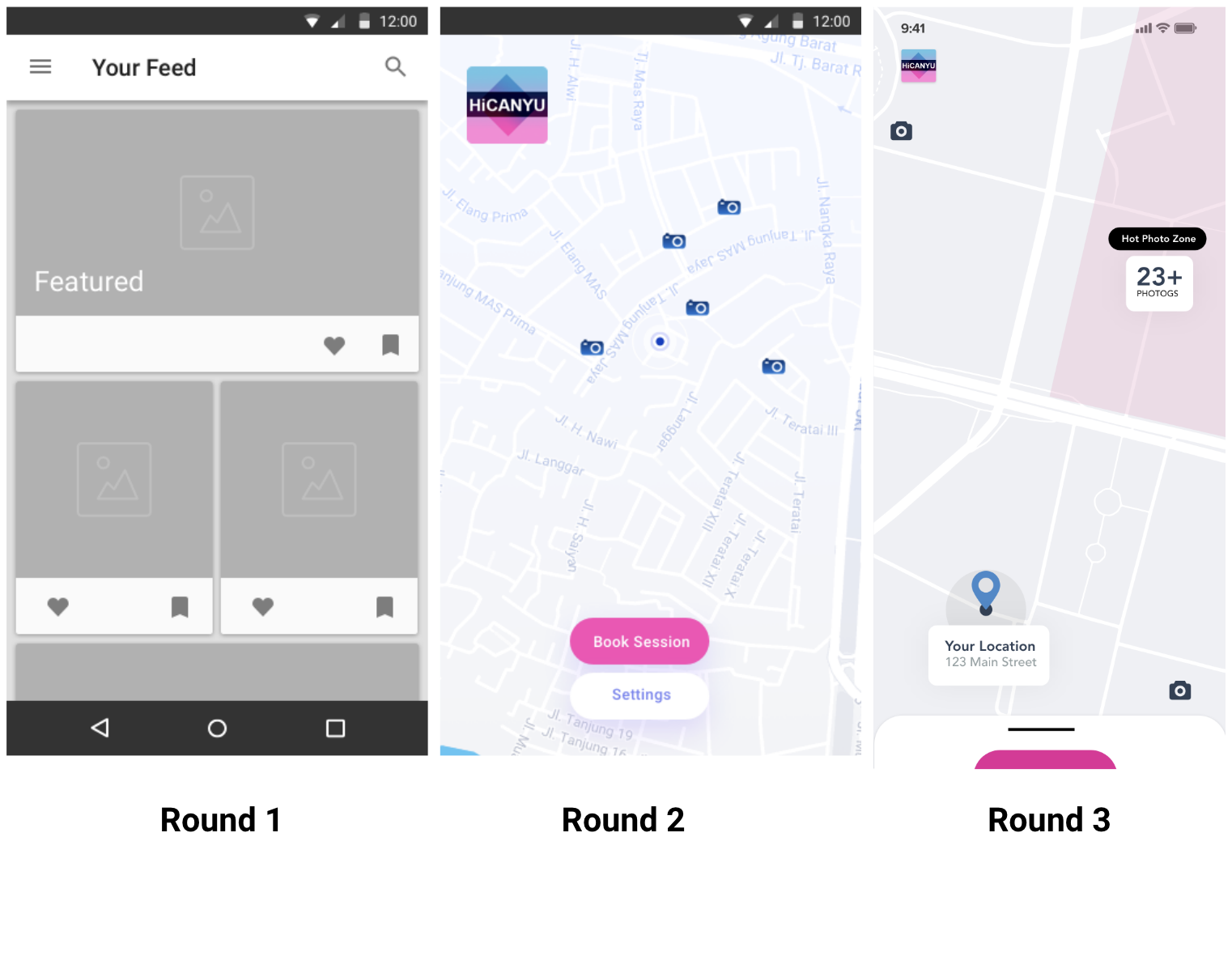
Phase One, Remote: We took one feature to User Bob for quick feedback with a wide audience. We quickly learned that users wanted more context around this new idea. We also decided that we’d like to see folks interact with the ideas in person.

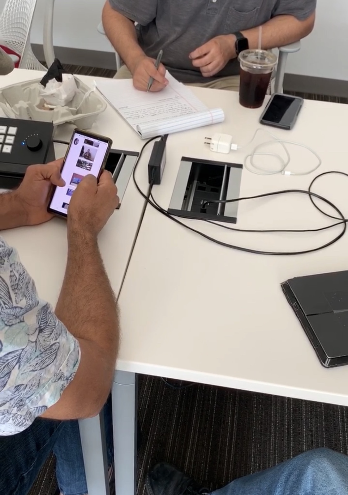
Phase Two, User Interviews Round 1: We narrowed the scope and identified people with travel experience. We presented them with a few more concepts than the last. We learned about users time consciousness and frugality in this step. Some tests were virtual, some onsite.

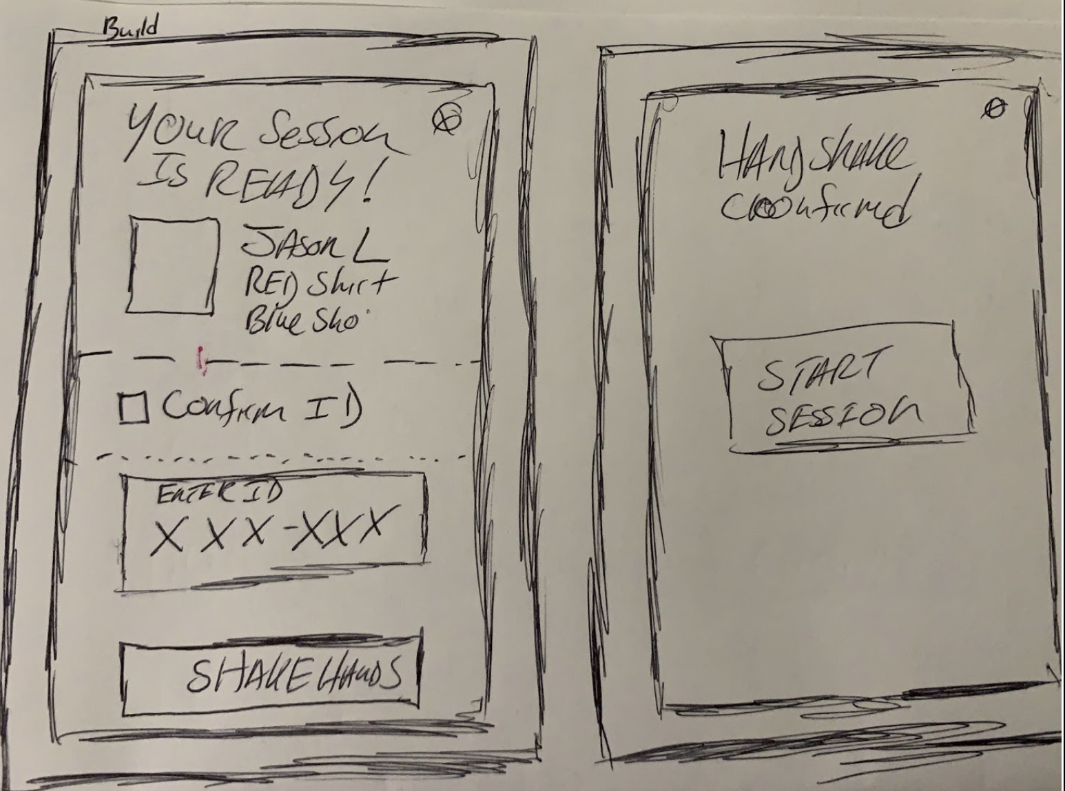
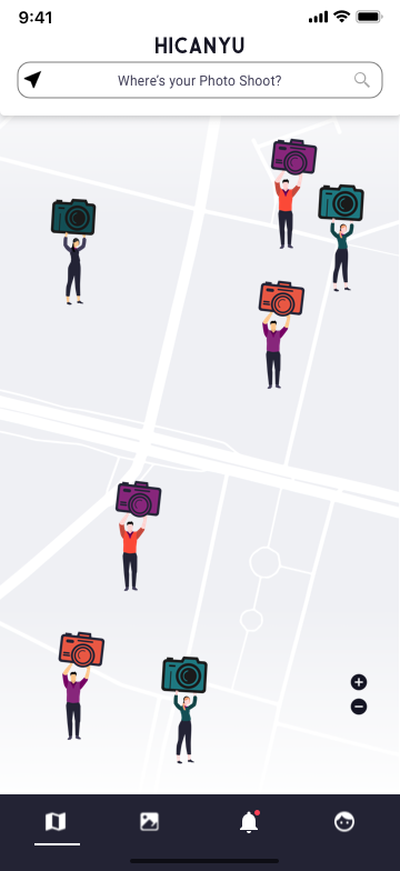
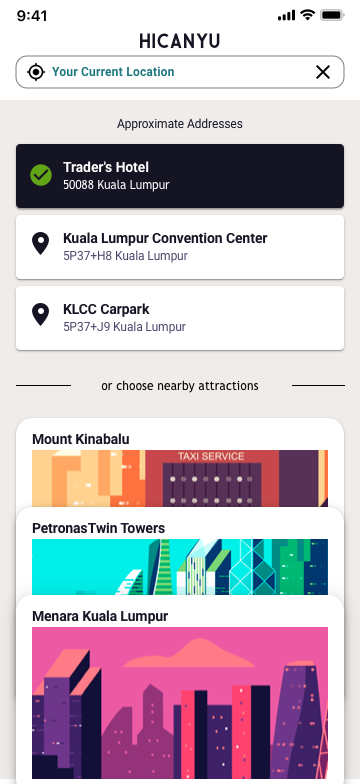
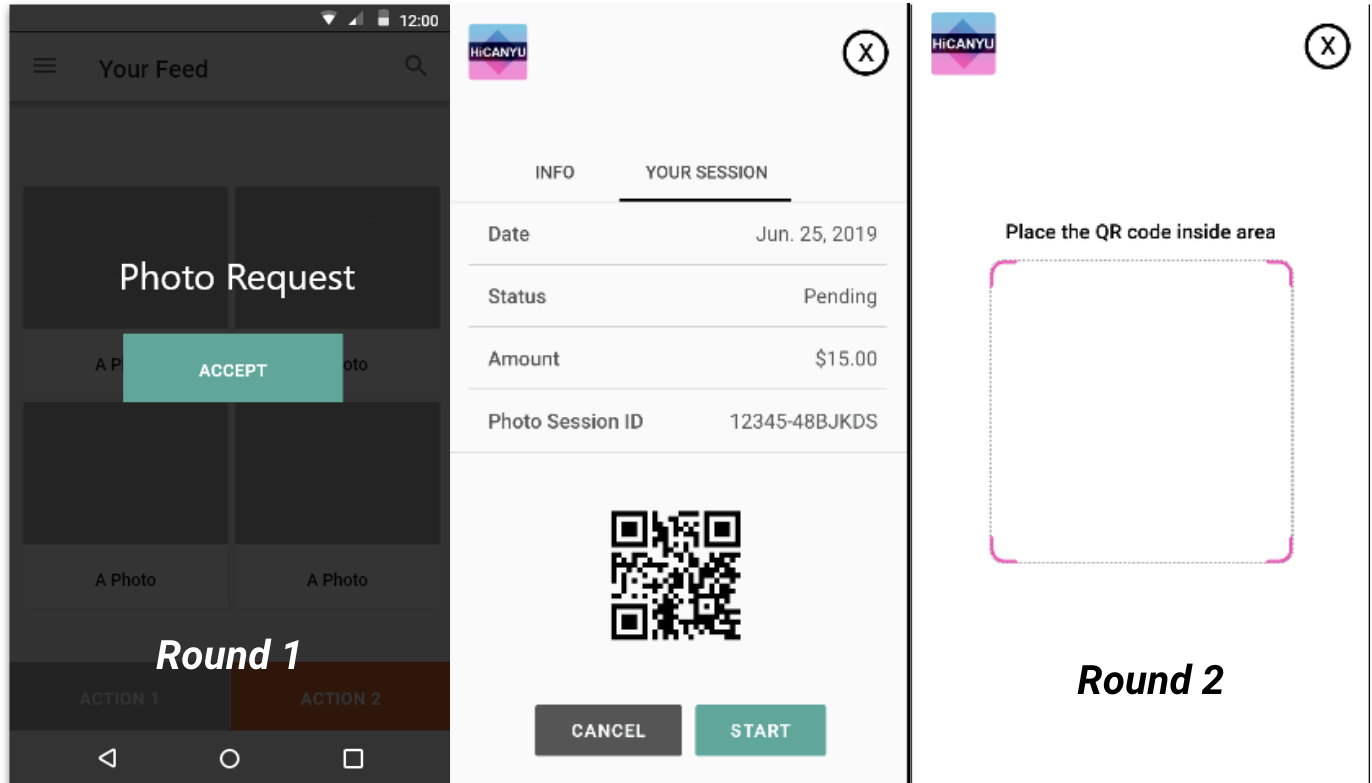
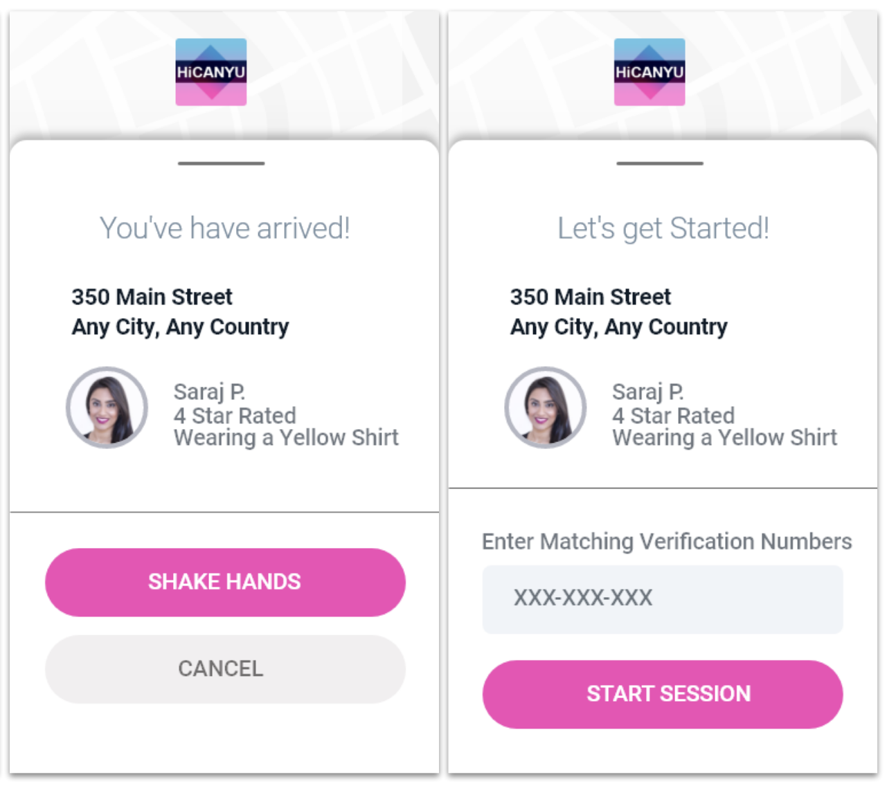
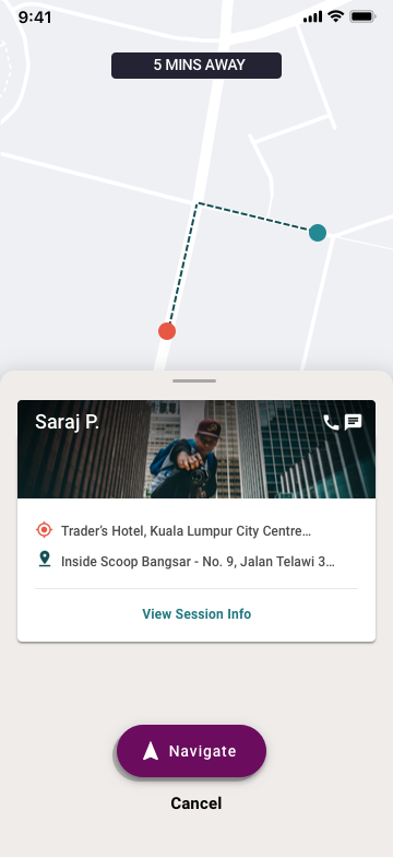
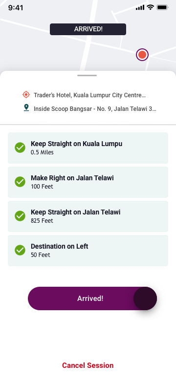
Phase Three, Usability Test: I took data from previous sessions along with other business considerations to build out a high-fi end to end prototype. We had a60 min sessions, a 45 min walk through and a 15 min self expression conversation. We really wanted to hear users thoughts around travel in general, so that we could validate the convenience factor.

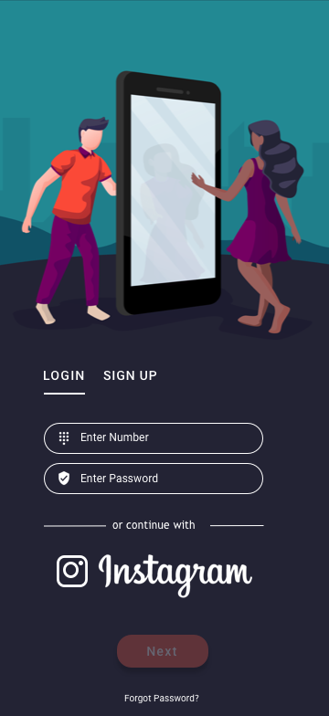
Learning things like ” I have to prioritize other things when using my SIM card, I probably won’t have access until I’ve gotten back to the hotel”. This was something that hadn’t been previously considered. Now we know that cloud integration is necessary and I need to build a bookmark feature into the design.

Primary Research

In talking to travelers, mentioned using services like Uber and Lyft. It seemed natural to try and compliment their expectations about similar services. When traveling, logistically, you expect everything to work seamlessly.

So, I drove Lyft  for a week and It was surprisingly addictive.

HiCanYu also has a Photographer or “Back-End” Experience. My goal was to gather data on how companies with two sided markets present their platform. Was the service provider’s (Gig worker) experience consistent with the everyday users? I had so many question, so I dove in and saw for myself.

The majority of my riders loved to answer questions about their travel, especially the Airport riders. I did about ten guerrilla user interviews as I drove them to their destinations. This was such a sweet way to gather information and CA$H! The whole experience  was a vibe!

Building Features


Onboarding

In testing, we learned that some people would like to jump right in to use the service, while others wanted to take their time and explore. I had to figure out a happy medium, something that would allow folks to embrace their pace.

A quick sixty second video was the top idea to feature that we thought would work. However, due to the projects MVP status, I needed to propose something that allowed them to keep it light for the time being.

Note: I did the Visual Design, Art Direction, Brand Strategy & Interaction on all screens.

Design Outcome

Homepage Design

The landing page went through a couple iterations. There was a feed style and map styled home page. The information I pulled from Lyft made me think critically about locating people in mass.  We even tested a hot spot map. Ultimately, I decided to keep it simple with a touch of whimsy. Convenience and quick on-boarding continually resonated with our participants.

Users can choose to search for locations or use their current location for photoshoots. In thinking about the current location flow, I wanted to show popular destinations and take out the guess work. Some travelers want to do all the tourist things, here’s another way to accomplish that and have a photo shoot.

Design Outcome

Home Screen
Use Current Location
Search Locations

Making Connections

Once you’ve been connected with a “Photog”, you have to meet up with them. There were a few different approaches to this at the beginning. We tested QR codes initially but after contrasting feedback, the “Hand Shake” was created. Whatever we did, it needed to be simple and easy. You can’t beat a good ole bar code!

I also built in walking navigation for users. Another takeaway from the Lyft experience was getting to and from. As a driver, you can choose to employ their baked in solution or a popular nav app (Google, Apple or Waze). I wanted to be able to give these users that choice as-well. (This feature hasn’t been tested)

Overall, This project was such a joy to work on. The challenges allowed me to stretch, find creative ways to solve problems and create new exciting ways around how I approach the UCD process. I’m proud of what we accomplished and I’m grateful for the opportunity. If you are an Investor and currently looking for innovative ideas, hit up HiCanYu  and tell them “Dee” sent you!

Check out the Prototype below! 

Design Outcome

Playtime


Prototype